
BRAND IDENTITY & CAMPAIGN DESIGN
A brand built to connect.
Bringing a human perspective to technology through a cohesive brand system, thoughtful print design, and expressive social campaigns.
CLIENT
Alasconnect
MY CONTRIBUTION
Brand Guidelines & Creative Design
MY DELIVERABLES
Style Guide • Print • Social • Web
THE PROJECT
One visual language.
Every point of connection.
I developed Alasconnect’s brand style guide and extended its visual language across print collateral and social media creative. The work connects the brand’s “Humanizing Technology” positioning with a recognizable design system, balancing the confidence of an IT provider with a more approachable, human presence.
My focus was translating the identity into practical design decisions: how the logo appears, how type establishes hierarchy, how color creates emphasis, and how the system adapts to different audiences and formats.
01 / THE FOUNDATION
A system with clear direction.
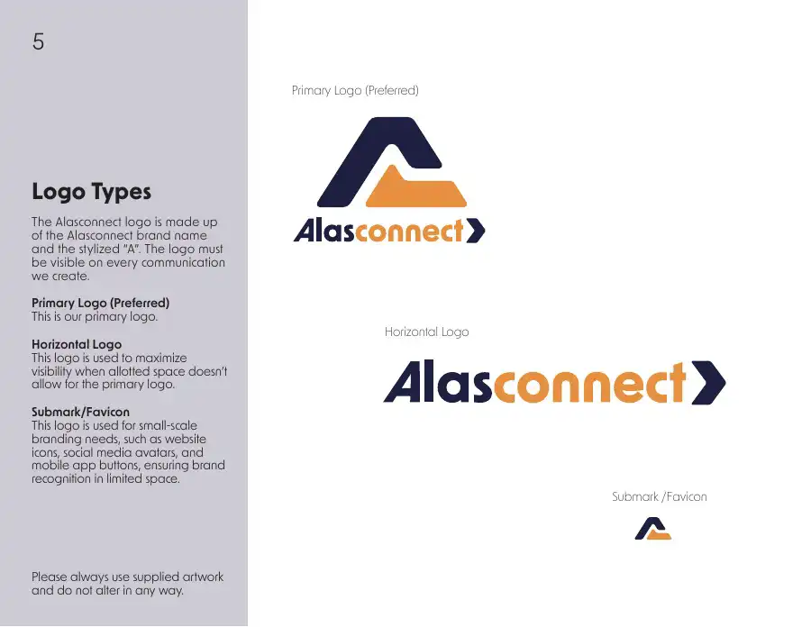
The 16-page style guide turns the identity into a usable reference for consistent communication across digital and physical touchpoints.
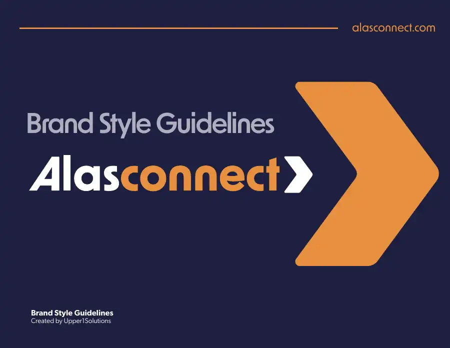
ALASCONNECT BRAND STYLE GUIDELINES
01
Define the essentials.
Logo configurations, color variations, clear space, and minimum sizes establish a consistent foundation for the identity.
02
Create a clear hierarchy.
New Order provides the core typographic voice, while P22 Freely introduces expressive emphasis. Color and scale give each message a focal point.
03
Make it usable.
Documented standards and application examples connect brand principles to the everyday decisions behind print and digital creative.
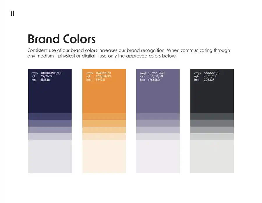
Deep Navy
#1B1548
Orange
#F89721
Muted Purple
#766E8D
Charcoal
#303337
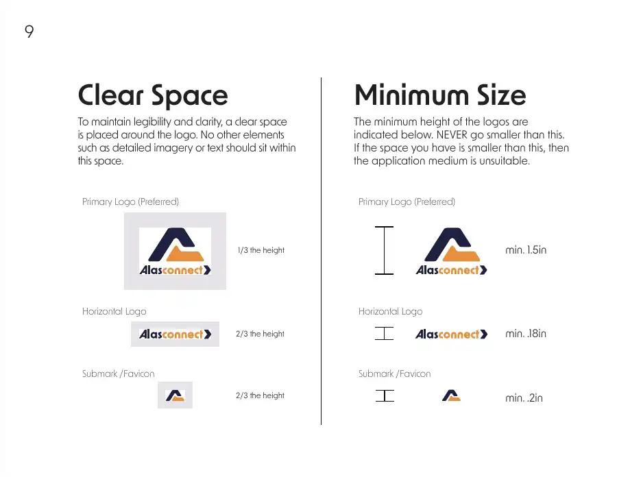
Precision in the details / Logo standards
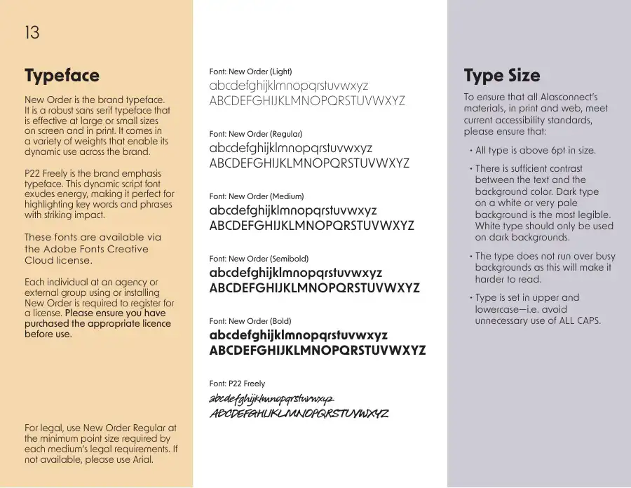
A consistent voice / Typography standards
02 / PRINT & EVENT COLLATERAL
Complex services.
Clear communication.
I applied the brand system to healthcare and conference collateral, organizing detailed service information through deliberate hierarchy, imagery, and clear calls to action.

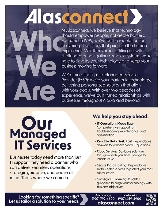

DESIGN THINKING
The same navy-and-orange palette, prominent headlines, and directional chevron from the logo to tie the pieces together, while the content and imagery shift to meet each audience.
03 / SOCIAL CAMPAIGNS
Serious technology.
A more human expression.
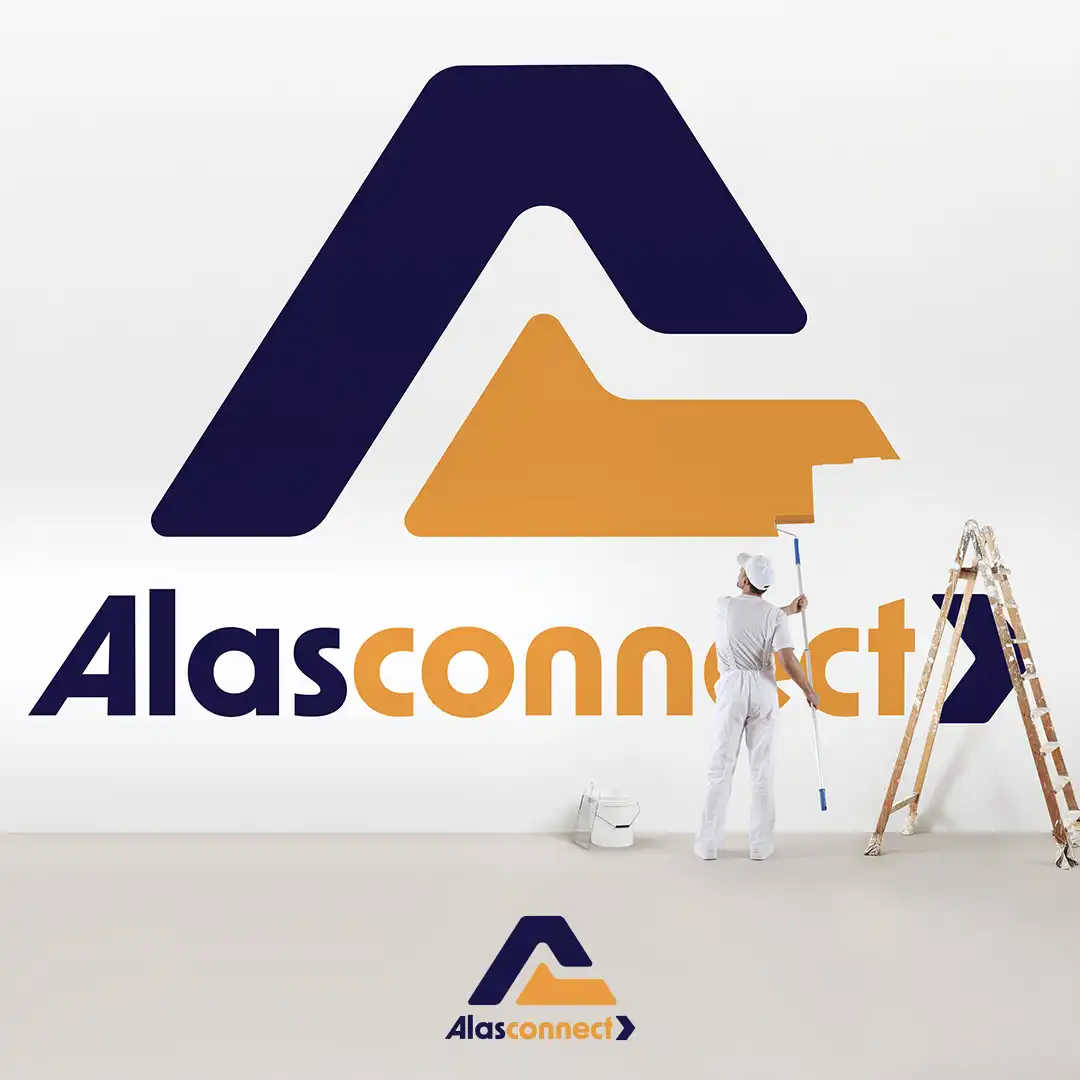
For social, I used visual metaphors to make abstract IT services tangible: a lifeboat for recovery, an umbrella for protection, and a strong link for cybersecurity. Consistent branding keeps the range of concepts connected.





THE THROUGHLINE
From brand rules
to brand recognition.
Together, the guide and campaign work show how I move from defining a visual system to applying it across channels, keeping the brand recognizable while giving each message its own expression.